Schedlar.
Simplify your routine and enhance your productivity
Simplify your routine and enhance your productivity
The problem addressed by this application is related to the difficulty many people face when trying to incorporate new habits into their daily routines.
This difficulty can result in a range of emotional and practical challenges, including lack of motivation, overwhelm, discouragement, and ineffective tracking.
An app designed to address these challenges can be a valuable tool to help people overcome these obstacles and achieve their goals more effectively.
The Product Owner, Nicolas Reichert, is an expert front-end Engineer and sees opportunities in the market, to develop a system that can be used for personal use, and expand how to share routines and habits with friends or clients.
So, I was hired for this project to craft the user experience, concept the user interface and document the visual systems of this app. I do this with frequency for companies and after briefing meetings I can create a proposal of work that fits with the client's motivations.
1
Research on references from other similar apps
2
Defining and mapping the navigation structure involves outlining how different sections and features are organized within a system
3
Structuring responsive on all project pages.
4
Defining and documenting all modules treated as a Design System.
In conversations and interviews with the client, based on their expectations for using the application, we defined a set of functionalities to design. Thus, we established the following scope of work:
Analyzing similar apps in the market helps understand user expectations and existing design conventions. This is crucial for creating an experience that users are already familiar with.
Observing various apps helps identify emerging trends in user interface design. This is especially important to keep the design updated and aligned with user preferences.
By observing how other apps have tackled similar challenges, you can validate or adjust your own design decisions. This contributes to a more informed and grounded process.
Basically here we create a simple map, that represents how the modules are connected, and how the user can navigate through the features. This gives support to build a resilient navigation for the product and create better user journeys.
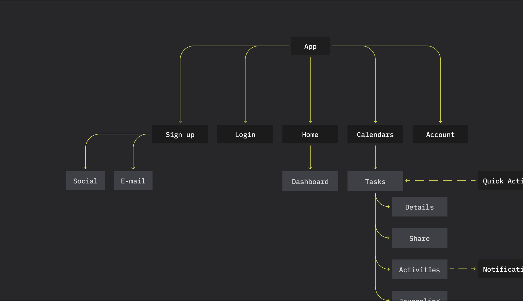
This map doesn't have to be necessarily created in the beginning of the project, but can be an asset used to meetings with clients and developers to understand the whole thing.
I initiated the Design System project by defining an architecture and organizing a package of variables. This project was intended for a single brand and included two light modes: Light and Dark.
I used Figma to create all the variables, which were later translated into a CSS file responsible for providing global colors, text sizes, and other styles. This allowed for global changes during the design process, enabling us to make visual design alterations without compromising the structure of pages or components.
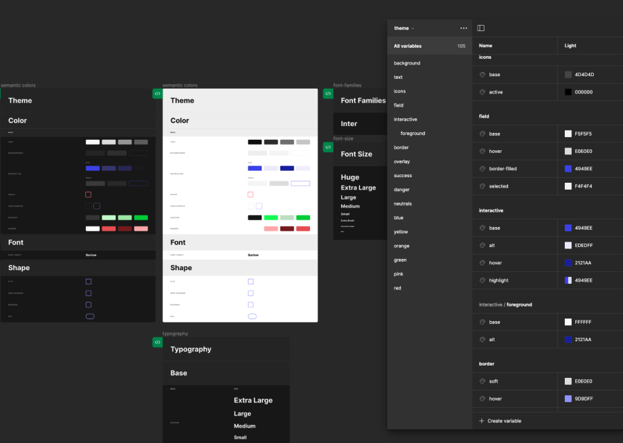
components
pages
modes
variables
The interface design process was carried out as we evolved our discussions about the project scope. Initially, I focused on desktop interfaces, creating the platform's macro interactions. In the video, I showcase an example of the login, designed using Figma. We chose to provide access through a Google account and via email, using a PIN Code sent to the user.
Our goal was to streamline the entry for initial users, eliminating the hassle of remembering passwords. In addition, we aimed to provide a widely used login method through Google.
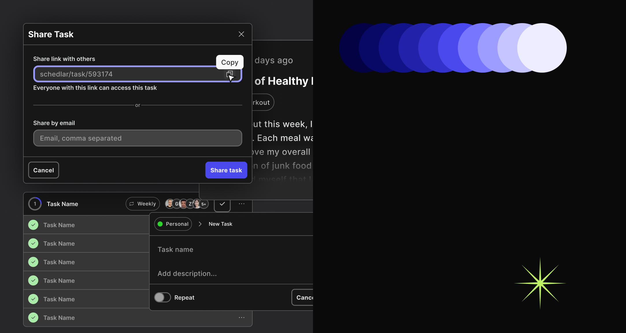
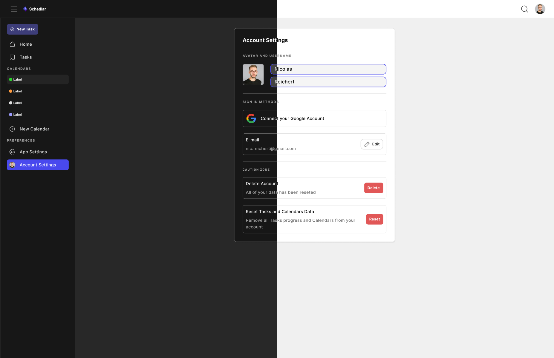
Additionally, we prototyped other features such as creating a new task, adding comments, sharing tasks, and viewing the tasks themselves. In an overall workflow, my role, in addition to visually crafting the experience, involved defining alert systems, modals, buttons, and forms in a way that we could reuse the modules later. I documented the assets in Figma, enabling us to have an extensive library of UI components and modules.
Moreover, it was necessary to create breakpoints for the layout and implement responsive interactions. In this project, we employed the concept of fluid components, which easily allowed us to adapt our material for different devices.
In this project, by implementing a system of variables, it was possible to switch between color modes for a lighter and darker visual appearance. In the video, there's an example applied to the task interface.
This project lasted approximately 5 months and is currently being continued by another team that inherited the resources created here. Additionally, I am unable to share more specific details such as documents or prototypes demonstrating the usability of the product.